Color is not just decoration — it is communication.
Before a customer reads your business name or understands your services, they subconsciously respond to color. In signage design, color psychology plays a critical role in shaping perception, influencing emotion, and driving customer behavior.
Different industries require different color strategies. A fast-food brand should not communicate like a bank. A luxury fashion boutique should not look like a hospital. Color selection in signage must align with the psychology of the target market and the expectations of the industry.
When strategically applied, color psychology in signage can:
* Increase brand recognition
* Improve visibility
* Strengthen emotional connection
* Influence buying decisions
* Enhance professionalism
* Boost conversion rates
In this comprehensive guide, we will explore how various market segments should use color psychology in their signage for better customer response and long-term brand growth.
Color psychology refers to how colors influence human emotions, behaviors, and perceptions. In signage, color affects:
* Readability
* Visibility
* Brand identity
* Emotional reaction
* Purchase decisions
Studies consistently show that customers form first impressions within seconds — and color is a dominant factor in that decision-making process.
Effective signage color selection must consider:
* Industry standards
* Cultural interpretation
* Environmental lighting
* Competitive differentiation
* Brand positioning
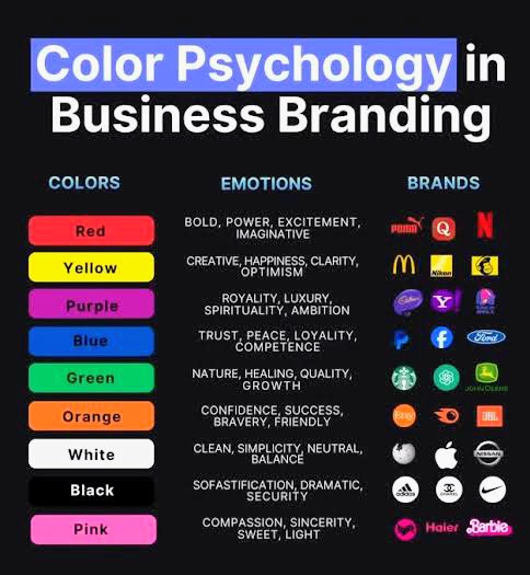
Before diving into industry-specific strategies, let’s understand what major colors typically represent:
* Red – Energy, urgency, appetite stimulation
* Blue– Trust, stability, professionalism
* Green – Health, growth, sustainability
* Yellow – Optimism, attention-grabbing, affordability
* Black – Luxury, authority, sophistication
* White – Cleanliness, simplicity, purity
* Orange – Enthusiasm, affordability, friendliness
* Purple– Creativity, premium positioning, uniqueness
Color interpretation may vary slightly across cultures, but these associations are widely recognized in commercial environments.
1. Food & Hospitality Industry
Restaurants, cafes, food trucks, and fast-food chains must evoke appetite, warmth, and excitement.
•Recommended Colors:
* Red
* Yellow
* Orange
•Why It Works:
Red stimulates appetite and urgency. Yellow grabs attention quickly, making it ideal for roadside visibility. Orange creates warmth and approachability.
Fast-food brands often combine red and yellow because the combination encourages quick decisions and fast turnover.
•Premium Dining Strategy
For fine dining establishments, consider:
* Deep burgundy
* Dark green
* Black with gold accents
These colors communicate sophistication and exclusivity.
• Avoid:
* Overuse of blue (may suppress appetite)
* Low-contrast combinations that reduce readability
2. Fashion & Retail Industry
Fashion brands rely heavily on perception and identity.
•Luxury Fashion
Recommended colors:
* Black
* Gold
* White
* Neutral tones
These colors signal elegance and exclusivity.
•Youth & Trendy Fashion
Recommended colors:
* Bright pink
* Electric blue
* Purple
* Neon accents
These colors convey boldness and creativity.
• Everyday Retail Stores
Use:
* Blue for trust
* Green for affordability
* Orange for friendly appeal
Retail signage must stand out while maintaining clarity.
3. Finance & Banking Sector
Trust is everything in finance.
• Recommended Colors:
* Blue
* Dark green
* Grey
Blue communicates reliability and stability. Green suggests financial growth and prosperity.
Avoid overly bright or playful colors, as they may reduce perceived credibility.
Professional finance signage should maintain:
* Clean design
* Strong contrast
* Minimal distractions
4. Healthcare & Medical Industry
Healthcare signage must communicate safety and cleanliness.
Recommended Colors:
* Blue
* Green
* White
Blue reassures patients. Green represents healing and calmness. White symbolizes hygiene.
Avoid aggressive reds unless used sparingly for emergency or urgent care indicators.
5. Real Estate & Property Development
Real estate branding should communicate stability and aspiration.
Recommended Colors:
* Navy blue
* Gold
* Dark green
* Earth tones
These colors project confidence and long-term value.
6. Education Sector
Schools and training centers need colors that inspire learning and trust.
Recommended Colors:
* Blue (focus and intelligence)
* Yellow (energy and optimism)
* Green (growth and development)
Educational signage must remain readable and welcoming.
7. Technology & Corporate Services
Tech companies often use:
* Blue
* Silver
* Black
* White
These colors communicate innovation and professionalism.
Modern typography combined with clean color palettes enhances authority.
Color psychology must align with visibility standards.
High contrast combinations such as:
* Black on white
* White on navy
* Yellow on black
Ensure readability from a distance.
Low contrast combinations reduce effectiveness, especially outdoors.
Outdoor signage colors may appear different due to:
* Sunlight intensity
* Night lighting
* Surrounding building colors
* Weather conditions
Professional color testing before final production ensures accuracy.
Businesses operating in diverse communities must consider cultural associations with color. For example:
* White may symbolize purity in some cultures but mourning in others.
* Red may symbolize celebration or danger depending on context.
Understanding your audience ensures better reception.
Effective signage often uses:
* Primary brand color
* Secondary accent color
* Neutral background
Overuse of too many colors creates visual clutter.
Simplicity increases memorability.
Retail and event-based businesses may adjust signage colors seasonally to:
* Reflect festive themes
* Increase relevance
* Capture seasonal attention
Temporary overlays or LED lighting modifications allow flexibility without full redesign.
Call-to-action buttons and contact details should use:
* Red for urgency
* Orange for action
* Green for positive engagement
Highlighting phone numbers in contrasting colors increases response rates.
1. Choosing trendy colors without strategy
2. Ignoring contrast rules
3. Overcrowding with multiple bright colors
4. Failing to test visibility from a distance
5. Not aligning color with brand identity
Professional guidance prevents these errors.
Correct color strategy can:
* Increase walk-in traffic
* Improve brand recall
* Strengthen emotional connection
* Increase customer trust
* Improve conversion rates
Color is not decoration — it is a revenue tool.
Why Professional Expertise Matters
Color selection requires:
* Understanding psychology
* Industry research
* Visibility testing
* Brand alignment
* Material knowledge
An experienced signage company ensures colors translate effectively from design screen to physical installation.
At SignFix Industrial Limited, we understand that color is more than aesthetics — it is strategy.
We provide:
✔ Industry-specific color consultation
✔ Brand-aligned signage design
✔ High-quality color-accurate printing
✔ Durable UV-resistant finishes
✔ Expert installation
✔ Visibility optimization
✔ Market-focused design strategy
✔ Long-term branding consistency
Our team ensures your signage color choices not only look attractive but also drive customer engagement and sales.
SignFix transforms color psychology into measurable business growth.
Signage color psychology is a powerful business tool. When aligned with market segments and industry expectations, color becomes a silent salesperson working 24/7 for your brand.
From food and fashion to finance and healthcare, strategic color selection:
* Influences perception
* Builds trust
* Enhances visibility
* Drives customer response
Investing in professional color strategy ensures your signage communicates the right message to the right audience — effectively and profitably.
Contact Us at support@signfix.ng or info@signfix.ng or Call Us +234 903 336 6660
Let’s design signage that speaks the right color language to your market and drives measurable results.


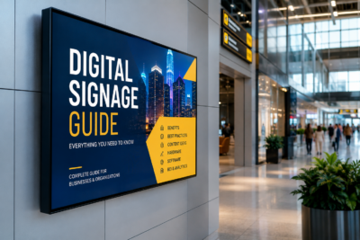
Businesses today operate in an increasingly competitive environment where capturing
Schools are dynamic environments filled with students, teachers, administrators, parents,

Construction sites are among the most dynamic and high-risk working
The reception area is the first physical touchpoint between a