Why Billboards Still Dominate Outdoor Advertising
In a world dominated by digital marketing, you might think billboards are losing relevance. In reality, billboards are evolving blending traditional reach with modern design strategies to create unforgettable impressions. Whether you’re driving through busy city streets or cruising along a highway, a well-designed billboard can grab your attention in seconds and leave a lasting brand memory.
In Nigeria and across the globe, billboards remain a powerful tool for brand visibility, event promotion, and high-impact advertising. But what makes one billboard unmissable and another fade into the background? The answer lies in smart design choices backed by marketing psychology.
This blog reveals proven design secrets to help you create billboards that don’t just get seen but get remembered.
1. Understand Your Billboard’s Purpose
Before diving into design, you must define the goal of your billboard. Is it to:
- Promote a product or service?
- Build brand recognition?
- Drive immediate action (e.g., visit a store, call a number)?
- Announce an event or launch?
This clarity influences your choice of layout, imagery, text, and call-to-action (CTA). For instance, a billboard promoting a limited-time sale might use bright colors and urgency driven text, while a brand awareness billboard may rely on bold imagery and a simple tagline.
2. The Power of Location
A billboard’s effectiveness is directly tied to where it’s placed. Consider:
- Traffic flow: High-traffic roads or intersections ensure maximum impressions.
- Viewing distance: Highways need larger fonts and fewer words compared to urban streets where viewers are closer.
- Surrounding environment: Your design should stand out against the background. For example, a green billboard might get lost in a leafy area, so choose contrasting colors.
In Nigeria, strategic billboard placement along Lagos–Ibadan Expressway, Abuja city center, or near major markets like Balogun or Onitsha Main Market can generate massive visibility.
3. Keep Text Minimal
Billboards are not brochures. Drivers typically have 5–7 seconds to read your message. Stick to:
- 6–10 words max
- Short, punchy headlines
- Large, readable fonts (sans-serif works best for distance viewing)
Example: Instead of
“Visit Our Store for the Best Electronics in Town”
use
“Best Electronics • Just Ahead!”
This minimal approach increases retention and prevents visual overload.
4. Bold Fonts and Legible Typography
When it comes to typography:
- Use bold, high contrast fonts.
- Avoid overly decorative typefaces.
- Ensure text color contrasts sharply with the background.
If your background is light, use dark bold text and vice versa. Fonts like Helvetica, Arial, and Futura Bold are billboard favorites for clarity and impact.
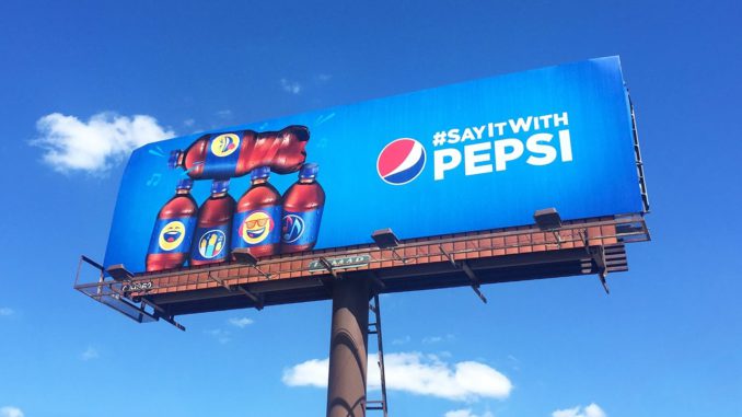
5. High-Impact Imagery
A single, strong image can communicate more than a paragraph of text.
Effective billboard imagery should be:
- Relevant to the message
- Emotionally engaging
- High resolution (no pixelation, even at large scale)
- Easily understood at a glance
If promoting a beverage, a close-up of a cold, condensation-covered glass can be far more enticing than a generic product shot.
6. Mastering Color Psychology
Colors influence mood, perception, and action. In billboard design:
- Red → Urgency, excitement (good for sales and promotions)
- Blue → Trust, professionalism (banks, corporate brands)
- Green → Nature, health (eco-friendly or organic brands)
- Yellow → Energy, happiness (youth-focused campaigns)
- Black/White → Sophistication, luxury (high-end products)
Contrast is key, a yellow font on a white background is hard to read, but yellow on black pops instantly.
7. Hierarchy of Information
A viewer’s eyes should move from headline → visual → CTA effortlessly.
Use:
- Larger font sizes for the main message
- Clear separation between headline and details
- A single, well placed CTA such as:
8. Creative Storytelling in Seconds
Billboards don’t give you much time, but you can still tell a micro story. Clever use of visual metaphors, humor, or intriguing imagery can hook viewers instantly.
Example:
A bakery could display a giant loaf of bread with steam curling into the shape of a heart, instantly communicating warmth, love, and freshness.
9. Day & Night Visibility
Billboards work 24/7, so ensure your design is effective in all lighting conditions:
- Use backlit or LED billboards for nighttime clarity.
- Avoid overly dark backgrounds if the billboard won’t be illuminated.
- Reflective materials can help with visibility after dark.
10. Digital Billboards: The New Frontier
With digital billboards, you can:
- Rotate multiple ads
- Display time-sensitive offers
- Integrate animations and motion graphics
- Adapt content to weather, events, or traffic conditions
Digital displays allow dynamic in-store advertising for retail brands, blending flexibility with high engagement.
11. Consistent Branding
Your billboard should look and feel like your other marketing channels:
- Use your brand colors, fonts, and tone.
- Include your logo prominently but without overpowering the message.
- Maintain a consistent message across print, digital, and in-store ads.
12. Testing and Tracking Effectiveness
A billboard’s ROI can be tracked using:
- Unique promo codes
- Custom landing page URLs
- QR codes (effective for pedestrian-heavy areas)
- Customer surveys (“How did you hear about us?”)
Analyzing these results helps refine future billboard designs for even better performance.
Making Every Second Count
An effective billboard is part art, part science. By combining bold visuals, concise messaging, strategic placement, and strong branding, you can create billboards that not only get noticed but also drive action.
In today’s crowded advertising space, visibility isn’t just about being seen, it’s about being remembered. Master these design secrets, and your billboards will turn heads, spark conversations, and convert viewers into customers.