Introduction
When customers walk past your store, glance at your billboard, or interact with your office environment, they make snap judgments in seconds. One of the most powerful and often overlooked drivers of these judgments is color.
While most businesses invest in marketing, logos, and slogans, many underestimate the importance of color in their signage, which is often the first physical touchpoint between your brand and potential customers. In fact, studies show that up to 90% of a customer’s first impression is influenced by color alone.
In this blog, we delve into how strategic color use in signage design affects how people perceive, feel, and act, and why it could make or break your branding efforts.
The Science Behind Color and Human Emotion
Before diving into signage, it’s important to understand why color is such a powerful psychological tool.
Colors influence our mood, attention, and decision-making. The field of color psychology explores how each hue triggers different emotional responses:
-
Red = energy, urgency, power
-
Blue = trust, calm, reliability
-
Yellow = optimism, warmth, attention
-
Green = health, nature, stability
-
Black = luxury, authority, sophistication
This means that color doesn’t just decorate your sign; it communicates silently, influencing whether people stop, trust, or buy.
Why Color in Signage Matters More Than You Think
Your brand signage isn’t just a nameplate or directional tool; it’s a non-verbal ambassador for your business. Whether you’re running a retail shop in Lagos, a corporate office in Abuja, or a hospitality brand in Port Harcourt, your choice of color plays a critical role in your customers’ subconscious perception.
1. Instant Brand Recognition
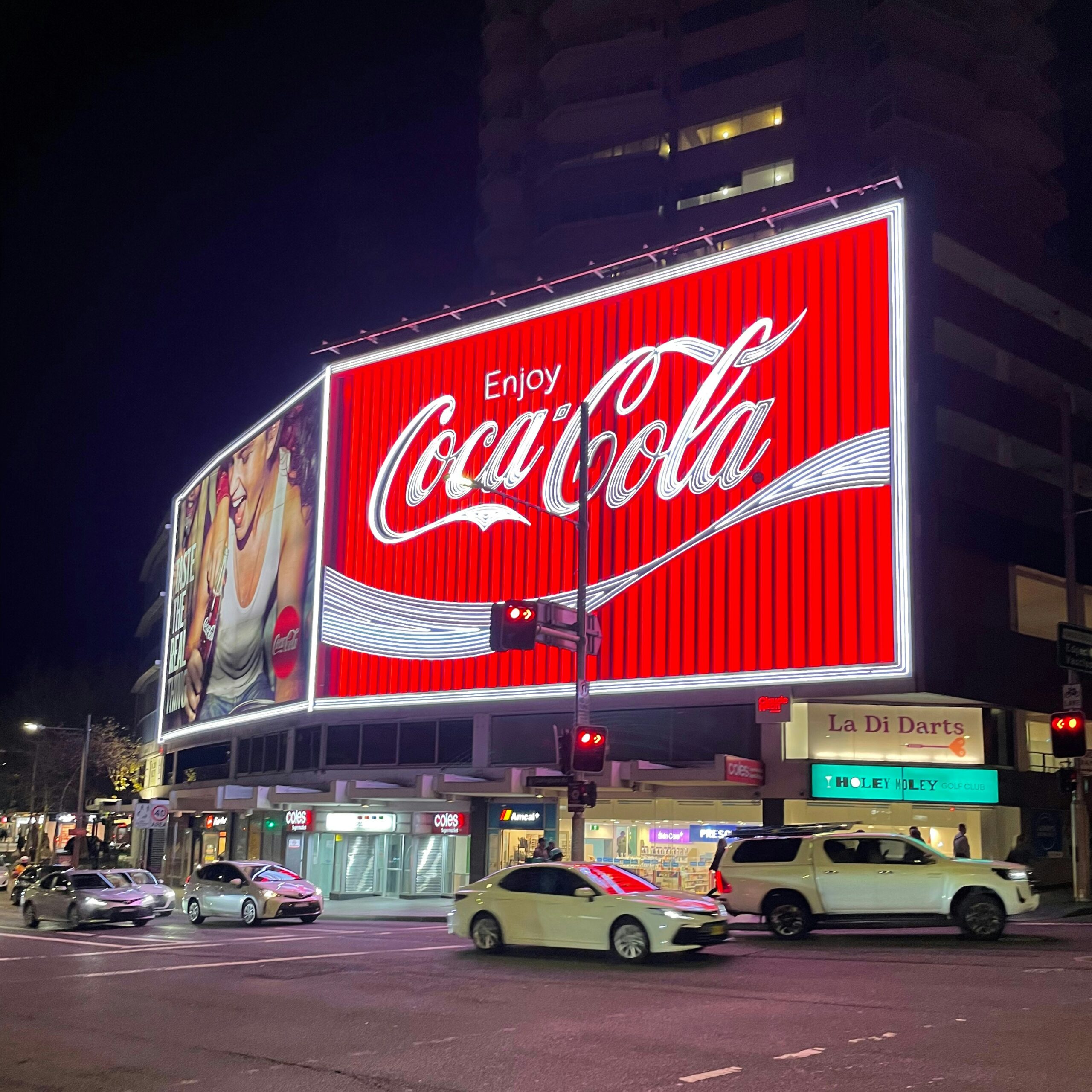
Studies have shown that color increases brand recognition by up to 80%. Think about Coca-Cola’s red, MTN’s yellow, or Facebook’s blue. Their colors are almost as recognizable as their logos.
For business signage, this means consistency in brand colors across indoor signs, outdoor billboards, and directional signage helps embed your identity in the customer’s memory.
2. Drives Foot Traffic
Bright, warm colors like red, yellow, and orange tend to grab attention quickly. That’s why fast food brands often use these colors in their external signage. Cooler tones like green or blue, while less aggressive, build a sense of trust and reliability, ideal for banks, hospitals, and educational institutions.
The right color combo can literally pull customers in, while the wrong one can make them pass by without a second glance.
3. Sets the Emotional Tone
Color evokes emotion. The mood your signage conveys must align with your brand promise:
-
A spa should avoid using aggressive colors like red.
-
A tech store may benefit from sleek blacks, greys, and blues to signal innovation.
-
A kids’ learning center should adopt playful tones like yellow, orange, and light blue.
If the color tone mismatches the service offered, customers may subconsciously feel “off” without even knowing why.
How Nigerian Businesses Can Leverage Color in Signage
In the Nigerian context, vibrant culture and expressive design offer huge room for creative, color-smart branding.
Retail and Supermarkets
Corporate and Finance
-
Use blues, greys, and whites for signage at banks, law firms, and insurance offices. These colors denote stability and professionalism, exactly what clients want to feel in these settings.
Hospitality and Restaurants
-
Earthy tones and rich colors like burgundy, gold, and olive green create a sense of warmth and indulgence.
-
Neon lighting in contrasting colors may work for lounges or nightlife venues, creating a sense of energy and allure.
Real Estate and Property Developers
-
Opt for muted luxury palettes, navy, charcoal, and gold to signal premium offerings.
-
For affordable housing, greens and oranges may reflect value and growth.
Combining Color with Typography and Lighting
Color doesn’t exist in isolation. It works in tandem with font style, illumination, and material. A well-lit blue sign in bold sans serif type conveys trust and strength. The same sign with cursive fonts and dim lighting might feel less professional and more artistic.
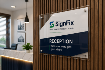
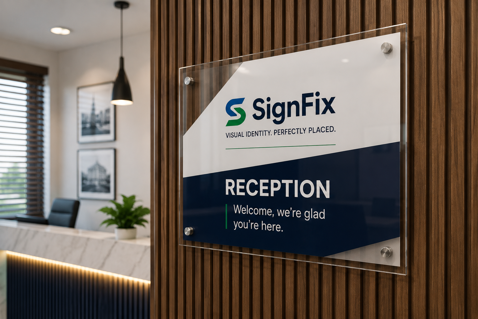
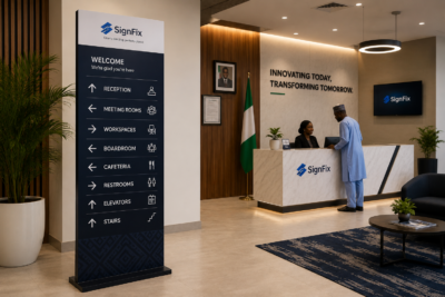
Signfix.ng, for example, integrates advanced materials and LED technology that ensures your brand color remains vibrant day or night, rain or shine.
Case Studies: Color in Action
Case Study 1: Fast Food Chain in Lagos
A local QSR (quick service restaurant) swapped its dull brown signage for a red and yellow backlit LED sign. Within three weeks, foot traffic increased by 28%. The bold colors aligned with global fast food psychology, creating a sense of urgency and stimulating appetite.
Case Study 2: Tech Startup Office in Abuja
The company used a blue-and-white color palette in both its external and internal signs. The result? Increased walk-in visits from job seekers, tech collaborators, and clients, all citing a “clean, modern” feel.
Common Color Mistakes in Business Signage
-
Inconsistency Across Channels
Using a slightly different shade of green on your storefront and business cards can dilute your identity. Always use HEX or Pantone color codes to maintain consistency.
-
Ignoring Cultural Context
In some African cultures, white symbolizes death, not peace. Understand your local audience before choosing colors with symbolic meaning.
-
Overloading Bright Colors
Using too many bright colors can overwhelm and confuse. Stick to a primary and secondary palette; don’t let your sign scream louder than your message.
Color Trends in 2025 Signage Design
As businesses become more intentional with their visual identity, here are some color trends for signage to watch:
-
Soft Gradients: Blends of two brand colors create visual depth.
-
Matte Metallics: Bronze and rose gold communicate luxury subtly.
-
Eco-Green Tones: Reflect a brand’s commitment to sustainability.
-
Bold Monochrome: One bold color in various shades to create a modern, minimalist impact.
Businesses that keep up with color trends without abandoning their brand core tend to stay relevant and recognizable.
Conclusion: Don’t Just Choose Colors. Strategize Them.
In a world overflowing with visual noise, color is your brand’s silent ambassador. It attracts, reassures, and connects before you ever say a word.
When applied strategically in signage, color becomes more than a design choice. it becomes a business advantage. Whether you’re refreshing your brand or launching a new product line, investing in professional signage that reflects thoughtful color psychology is a decision you won’t regret.
Ready to make your signage work smarter, not just harder?
At Signfix Industrial Limited, we don’t just print signs—we help you design brand experiences. Our team of signage experts understands color psychology, local business dynamics, and modern design principles to ensure your signage does more than mark a space; it moves minds.
Contact us today for a free color consultation and signage audit at support@signfix.ng or info@signfix.ng, or call +234 903 336 6660.