From Direction to Distinction
Every step a visitor takes inside a building or public space should tell a story preferably one aligned with your brand. Wayfinding signage isn’t just about arrows and names; it’s a crucial touchpoint where design, navigation, and brand values intersect.
In Nigerian airports, malls, schools, hospitals, and corporate environments, well designed wayfinding signage can significantly enhance visitor experience and earn your brand credibility and trust.
If you’re managing a public space, retail center, or corporate campus, crafting signage that guides and impresses matters more than ever.
What Is Branded Wayfinding Signage?
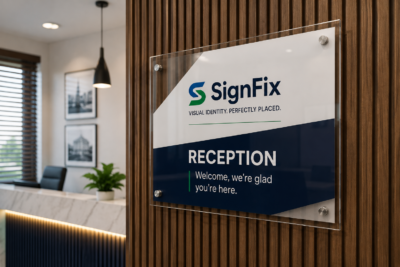
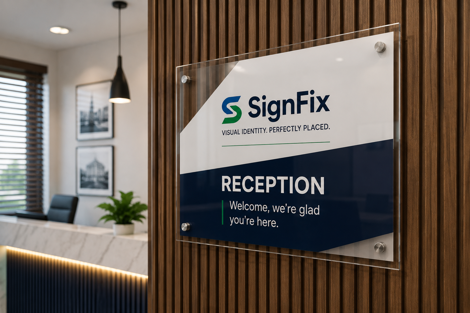
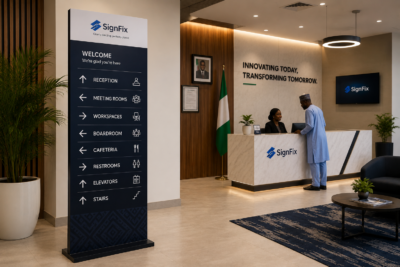
Branded wayfinding signage refers to navigational signs map directories, directional arrows, floor identifiers designed to reflect a brand’s visual identity (colors, font, logo) while guiding people effectively.
Instead of generic sign boards, each element from icons, material, light, typography, and placement is designed strategically to reinforce brand consistency while reducing visitor confusion.
Why It’s Essential in Nigeria
1. Seamless Visitor Flow
In busy environments airports like Murtala Muhammed or retail malls in Lagos clear navigation reduces stress and frustration. Branded signs add familiarity, helping visitors feel grounded within your space.
2. Trust & Professionalism
Signage integrated with your brand language communicates attention to detail and reliability especially in hospitals, universities, or corporate buildings.
3. Accessibility & Inclusivity
Signage that follows design standards icons, braille, high contrast improves accessibility. It’s not just good design; it’s responsible branding too.
Key Principles for Effective Branded Wayfinding
1. User Centered Design
Understand routes your visitors take: entrances, elevators, service desks, restrooms. Map out common journeys and design signs at decisional points places people hesitate or ask directions.
2. Consistency in Branding
Use your brand color palette across all signs. If your corporate palette includes teal and white, continue across arrow signs, map boards, and digital kiosks. Font, tone, and spacing should echo your brand guideline.
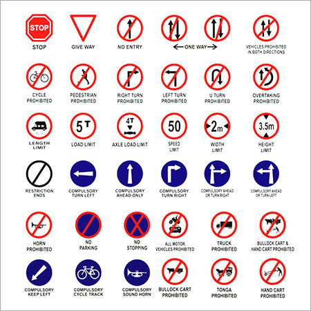
3. Clear Iconography and Language
Simple pictograms and concise wording (e.g., “Reception →”, “Exit” symbol) save mental effort. Pictograms should follow international conventions and remain readable at distance. High contrast combinations (white on dark or dark on white) enhance legibility.
4. Material & Durability
Choose materials that align with your brand values and environment. For indoor wayfinding acrylic, metal plated panels, brushed stainless, matte laminates offer professional appeal. Outdoor durable environments call for UV-resistant prints and CNC routed metal or PVC.
5. Lighting & Visibility
Interior spaces need well lit signs with LED backlighting, halo lit letters, or overhead spot lighting. At night, external directional signs and building identifiers should be illuminated for visibility and brand recognition.
Designing Branded Wayfinding: A Step by Step Guide
1. Audit Your Space
Document entry points, exits, confusing junctions, and high traffic paths.
2. Create User Journey Maps
Define scenarios: “first time visitor entering from front gate,” “visitor looking for stairs,” or “customer searching for the restroom.”
3. Develop Brand Compliant Sign Sets
Standardize sizes, colors, fonts (e.g., your two brand colors plus shades if needed), and icons across all sign types: directional posts, wall mounted arrows, map rooms, elevator directories.
4. Simulate Placement and Test Wayfinding
Create mock ups, walk the space, ask colleagues or outsiders to navigate validate clarity.
5. Install & Observe
Use strategic angles, avoid obstruction, test in low light. Follow up after installation to adjust where people still hesitate.
Branded Wayfinding Use Cases in Nigeria
Hospitals & Clinics
At healthcare facilities, branded wayfinding can reduce patient stress. Directional signs to wards, labs, billing, or pharmacies help patients and visitors navigate efficiently and the color consistency reinforces trust and clarity.
Shopping Malls & Mixed Use Complexes
Wayfinding boards that incorporate mall logos, store directories, and clear arrows elevate user ease and brand image. Digital directories with touchscreens enhance interactivity and retail engagement.
University Campuses
In universities like UNILAG or ABU Campus, branded directional signs help new students, visitors, or event attendees trace their routes easily. Signs may include maps along with faculty names, event schedules and school emblems.
Corporate Campuses
For corporate headquarters, branded signage for parking, meeting rooms, visitor entrances, and canteens ensures visitors and employees move with confidence within your environment.
Top Materials & Technology Choices
*Acrylic Panels: Crisp, modern, durable and great for indoor wayfinding.
*CNC Cut Metal Signs: Premium feel, especially when painted in brand colors or powder coated.
*LED Illuminated Signs: Essential for high end branding at night.
*Digital Touch Kiosks: Offers dynamic, updateable maps and directories ideal for large spaces or frequently changing setups.
*Braille & Tactile Panels: Enhances accessibility and compliance with international standards.
Benefits of Branded Wayfinding Signage
*Improved Customer Satisfaction: Decreased confusion leads to a more positive brand association.
*Reduced Staff Interruptions: Fewer directional queries equate to better focus on high-value tasks.
*Stronger Brand Identity: Consistent visual language across signs reinforces retention and loyalty.
*Cost effective Over Time: Modular or changeable signage (e.g., vinyl overlays or digital screens) allow updates without full replacements.
*Accessibility Compliance: Inclusive signage reflects positively on organization image.
Avoid These Common Mistakes
*Overcrowded Design: Too many icons or tiny text confuses. Keep directions minimal.
*Misaligned Branding: Inconsistent fonts or brand colors break cohesion.
*Wrong Placement Height: Signs too high or low create visibility issues opt for 4 to 6 ft from floor for typical eye level.
*Ignoring Maintenance: Regular cleaning and light checks sustain professional presentation.
*Non Accessible Signs: Missed braille or poor contrast limits usability for visually-impaired users.
Conclusion: Direction That Delivers
Branded wayfinding signage is more than directional tools—it’s a strategic brand asset. When designed with brand consistency and user insight, wayfinding signs help visitors move easily, feel confident, and remember your brand for professionalism and thoughtfulness.
Nigeria’s public venues, retail hubs, and corporate spaces deserve signage that guides and speaks with brand clarity. Get started by auditing your space, applying consistent design principles, and watching how purposeful navigation transforms the customer experience.
Call to Action
Thinking about branded wayfinding signage on your campus, retail space, or corporate environment? Reach out now for a professional wayfinding design audit tailored to align with your brand and increase visitor satisfaction.