Font choice is one of the most overlooked yet most impactful decisions in signage design. A beautifully designed sign with the wrong typeface can become illegible from a distance, feel mismatched with the brand it represents, or simply fail to communicate its message quickly enough to a passing customer. Unlike print or web design, signage fonts have to work under uniquely demanding conditions: varying light, distance, viewing angles, and often just a few seconds of viewer attention.
This guide breaks down how to choose the right signage fonts, covering readability principles, brand alignment, and the practical mistakes businesses should avoid.
Why Font Choice Matters More on Signage Than Anywhere Else
Fonts on a website or brochure are read up close, usually while the viewer is stationary and focused. Signage fonts, by contrast, are frequently viewed:
– From a distance, sometimes tens of meters away
– While the viewer is moving — walking, driving, or cycling past
– Under variable lighting conditions, from bright sunlight to dim evening visibility
– For only a few seconds before attention shifts elsewhere
Because of these constraints, a font that looks elegant on paper can become nearly unreadable once scaled onto a storefront sign or highway billboard. Signage typography needs to prioritize function first, aesthetics second.
Core Readability Principles
*Prioritize Simplicity Over Decoration:
Highly stylized, script, or overly thin fonts often struggle with legibility at a distance. Clean, well-spaced sans-serif fonts generally perform best for primary signage messaging, especially where quick recognition matters most.
*Maintain Adequate Letter Spacing:
Cramped lettering blurs together at a distance, especially in bright or low-contrast lighting. Adequate spacing between letters and words significantly improves how quickly a sign can be read.
*Use High Contrast Between Text and Background:
Even a perfectly chosen font becomes difficult to read if it lacks sufficient contrast against its background. Dark text on light backgrounds (or vice versa) consistently outperforms similar-toned combinations.
*Limit the Number of Fonts Per Sign:
Mixing more than two typefaces on a single sign creates visual clutter and slows down comprehension. Most effective signage relies on one primary font for headlines and, at most, one secondary font for supporting details.
Matching Font Choice to Viewing Distance
Signage font sizing and style should be selected based on the realistic viewing distance of the intended audience:
-Storefront and entrance signage viewed from a few meters away can incorporate slightly more detailed or branded fonts, since viewers have more time to read them
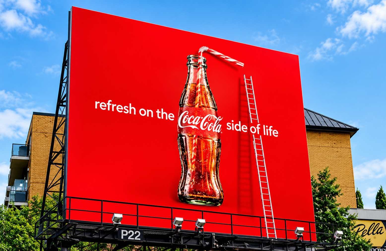
– Roadside and highway signage viewed from a distance while moving requires bold, simple lettering with generous spacing, since viewers only have a second or two to process the message
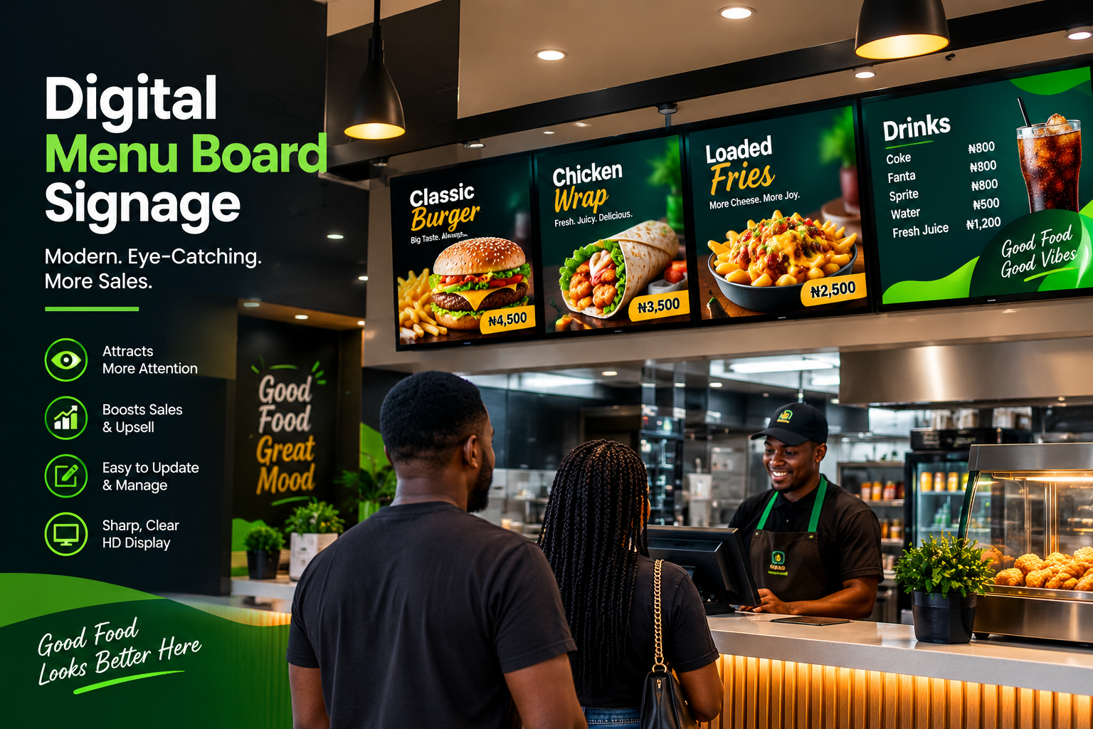
-Interior wayfinding signage should prioritize clarity and consistency over decorative branding, since functional clarity matters more than stylistic flair in these settings
Aligning Font Choice with Brand Identity
While readability comes first, font selection should still reflect the tone and personality of the brand:
– Modern, minimalist businesses often benefit from clean, geometric sans-serif fonts that feel contemporary and efficient
– Luxury or premium brands may use refined serif fonts for primary branding elements, provided they remain legible at the required viewing distance
– Playful or casual brands can incorporate friendlier, rounded fonts, as long as the core message remains clear and uncluttered
The key is finding a typeface that fits the brand’s personality without compromising the sign’s fundamental job: being read quickly and accurately.
Common Signage Font Mistakes
– Choosing decorative fonts for primary messaging, forcing viewers to work harder than necessary to read basic information
– Using all capital letters for long text blocks, which can actually reduce reading speed compared to standard sentence case
– Ignoring color contrast, pairing similarly toned text and background colors that blend together in certain lighting conditions
– Overcrowding signs with too much text, regardless of how well-chosen the font itself may be
– Failing to test fonts at actual sign size and distance before finalizing a design, relying only on a small screen preview
Testing Fonts Before Final Production
Before committing to full production, businesses should test chosen fonts under real-world conditions:
– Print or mock up the sign at actual size and view it from the intended distance
– Check legibility under different lighting conditions, including direct sunlight and evening visibility if relevant
– Get feedback from a few people unfamiliar with the design, checking how quickly they can read and understand the message
This simple testing step catches problems that are easy to miss when reviewing a design only on a computer screen.
Font selection may seem like a small detail compared to overall signage design, but it directly determines whether a sign successfully communicates its message or gets ignored entirely. By prioritizing readability, matching font choice to viewing distance, and aligning typography with brand identity, businesses can ensure their signage works as hard as it looks.
Choosing the right font and design elements requires both aesthetic sense and technical understanding of how signage performs in real-world conditions, and that’s exactly what SignFix Industrial Limited brings to every project. With over a decade of experience delivering signage and branding solutions across Nigeria and beyond, our design team ensures every sign we produce balances brand identity with genuine readability and impact. From concept through fabrication and installation, SignFix helps businesses create signage that communicates clearly and consistently.
Contact Us
📧 support@signfix.ng | info@signfix.ng
📞 Call Us: +234 903 336 6660