Signage plays a vital role in business and communication, serving as a powerful tool for branding, marketing, and customer engagement. Whether it’s a business storefront, a directional sign in a large building, or a digital display in a shopping center, effective signage conveys information clearly and influences consumer behavior. A well-designed sign can attract attention, guide visitors, reinforce brand identity, and ultimately drive sales. On the other hand, poorly executed signage can create confusion, deter potential customers, and damage a business’s overall image. Therefore, understanding the significance of signage and recognizing common design and placement mistakes is essential for maximizing its impact.
One of the primary functions of signage is to communicate messages efficiently to its target audience. This includes everything from brand recognition and product information to pricing, promotions, and wayfinding. For example, a restaurant with an eye-catching, easy-to-read menu board can influence a customer’s decision-making process, while an unclear or cluttered display may lead to indecision or disinterest. Additionally, directional signs in public spaces must be unambiguous to ensure visitors can navigate an area without frustration. If a sign is too small, placed in an inconvenient location, or uses jargon that is difficult to understand, it may fail to serve its intended purpose.
Beyond functional communication, signage is a critical component of brand identity. A consistent and professionally designed sign contributes to brand recognition and customer trust. When a business invests in high-quality, well-placed signage, it sends a message of credibility and professionalism. Conversely, an overlooked or neglected sign can make a business appear disorganized or untrustworthy. This is why recognizing common signage mistakes—such as incorrect formatting, inappropriate placement, or poor visibility, is crucial for maintaining a strong brand presence.
Before diving into specific errors to avoid, it’s important to acknowledge that signage is an investment that should not be overlooked. Whether it’s for a small local business or a large corporate office, the right signage can enhance visibility, improve customer experience, and reinforce a brand’s presence. By understanding the common mistakes that hinder signage effectiveness, businesses can ensure that their messaging is clear, their branding is cohesive, and their signage serves its intended purpose. In the next section, we will explore the most frequent signage mistakes and how to avoid them.
When designing and placing signage, businesses often make a series of avoidable mistakes that can significantly impact visibility and effectiveness. One of the most common errors is poor placement. A sign that is placed too high or too low, obstructed by trees, or situated in a location with no foot traffic will fail to capture the attention of its intended audience. Similarly, signs that are located in areas where visibility is limited, such as near sharp turns or behind objects, can be missed entirely by passersby. Optimal placement involves considering the viewing distance, eye level of the target audience, and the overall traffic patterns in the area.
Another frequent mistake is the use of unclear or overly complicated messaging. A sign is only effective if it conveys its message quickly and without confusion. Poorly written or overly verbose content can lead to customer disengagement, while a lack of clear instructions or information can result in missed opportunities. Businesses should ensure that their signage includes concise, easy-to-read text with a focus on the most important message. Avoiding unnecessary jargon or vague language is essential, as customers should be able to understand the purpose of the sign at a glance.
In addition to placement and messaging errors, visibility issues due to design choices are a common pitfall. Signs that use small fonts, low-contrast color schemes, or excessive text can be difficult to read from a distance. For digital or illuminated signs, inadequate brightness levels or incorrect lighting angles can render the message illegible in different lighting conditions. It is crucial to test the sign under varying lighting and weather conditions to ensure that it remains legible at all times.
To avoid these mistakes, businesses should conduct a thorough evaluation of their signage strategy. This includes assessing the placement for optimal visibility, simplifying and streamlining the message, and ensuring that the design elements, such as font size, color contrast, and lighting, are suitable for the intended audience. By addressing these common errors, businesses can create signage that effectively communicates their message and enhances customer engagement.
Readability and legibility are two critical factors that determine the effectiveness of any signage setup. While these terms are often used interchangeably, they refer to distinct elements of sign design that must be carefully balanced to ensure optimal communication with the target audience. Readability refers to how easily a viewer can process and understand the message presented on the sign. Legibility, on the other hand, relates to how clearly and effortlessly the individual characters or words can be discerned. A sign may be legible if the typeface is clear and the characters are distinguishable, but if the message is too complex or the layout is cluttered, its overall readability may suffer. Therefore, combining readability and legibility is essential for designing signs that effectively deliver their intended message to viewers.
One of the most critical aspects of enhancing readability and legibility is choosing the right font. The typeface significantly impacts how easily the message can be read from a distance. Using a font that is too ornate, has thin strokes, or includes excessive serifs can make the text difficult to decipher, especially from a distance. Popular choices for signages, such as sans-serif fonts like Helvetica or Arial, are often preferred for their clean, straightforward design. These fonts ensure that the text remains legible under various lighting conditions and from different viewing angles. Additionally, the font size must be proportionate to the viewing distance. Signs that are meant to be read from far away need larger text to accommodate the distance, while smaller signs placed closer to the viewer can use slightly smaller font sizes. As a general rule, one inch of letter height should correspond to every 10 feet of viewing distance. This ensures that the message is legible without requiring the viewer to be in close proximity to the sign.
Another critical element that influences readability is color contrast. The contrast between the text and the background plays a significant role in determining how clearly the message is perceived. Signs with low contrast—such as pale text on a light background or dark text on an equally dark surface—tend to be difficult to read. A high-contrast combination, such as white text on a black background or dark text on a light background, enhances legibility and allows the message to stand out. Additionally, the background color should complement the surrounding environment to prevent the sign from being lost within its surroundings. For example, a bright red sign may be highly visible in a rural setting with a green landscape but may stand out too much in an urban environment with colored buildings. Understanding how color affects visibility ensures that the sign remains effective regardless of the setting.
Spacing and layout also play an essential role in improving readability. A sign with excessive text, cramped lettering, or an unbalanced layout can overwhelm the viewer and hinder message absorption. To maintain clarity, the text should be spaced evenly, with sufficient white space between words and lines to prevent visual clutter. This principle of negative space ensures that the viewer’s eye can easily follow the message without confusion. Additionally, using bullet points, numbered lists, or clear headings can help organize the message in a more digestible format. For directional or wayfinding signs, a clean and straightforward layout with clear icons or arrows can further enhance visibility and understanding.
By prioritizing readability and legibility, businesses can ensure that their signage effectively communicates their message, reinforces brand identity, and maintains a high impact on viewers. A well-designed sign that balances font size, color contrast, and layout enhances visibility and engagement, making it an essential component of any signage strategy.
Real-world case studies provide compelling evidence of how addressing common signage mistakes can lead to remarkable transformations in customer engagement and business outcomes. One notable example is a local restaurant that previously struggled with low visibility due to an outdated, poorly placed sign that was nearly hidden by overgrown shrubs. The sign read “Taste of Tradition,” but it was small, using a font that was illegible from a distance, and the color contrast between the text and the background was minimal. As a result, the restaurant remained invisible to potential customers passing by. After a comprehensive review of their signage strategy, the restaurant made several critical changes. They removed the shrubs obstructing the sign, replaced the old sign with a larger, well-lit one, and opted for a bold, high-contrast color scheme that clearly stated the restaurant’s name and a brief, enticing description: “Authentic Global Flavors—Open Daily 11 AM – 9 PM.” This simple yet effective revamp significantly increased visibility, leading to a surge in customer foot traffic and a 30% rise in sales within just three months. The restaurant’s story underscores the importance of addressing visibility and legibility in signage design.
Another compelling example comes from a large retail store chain that faced challenges with inconsistent signage across their multiple locations. Each store had its own design, which led to confusion among customers expecting a uniform experience. The chain recognized that this inconsistency not only diminished brand recognition but also reduced the effectiveness of their marketing messages. In response, they implemented a comprehensive signage overhaul that included standardized font sizes, color schemes, and layout templates across all locations. They also introduced clear, directional signage to help customers navigate their vast spaces more easily. The outcome was remarkable; the improved signage not only enhanced customer experience but also contributed to a 20% increase in repeat visits and a 15% boost in overall sales. This case illustrates how a cohesive signage strategy can enhance brand recognition and improve customer satisfaction through clarity and consistency.
In the public sector, a city initiative aimed at improving wayfinding in a historic downtown area exemplifies the impact of well-designed signage. Prior to the project, visitors often found themselves disoriented due to the lack of clear directional signs. The city conducted a study to identify the most critical areas where signage was needed and gathered feedback from residents and tourists. The redesigned signage incorporated clear, bold typography, intuitive symbols, and a uniform color palette that matched the city’s historical architecture. As a result of these improvements, visitor satisfaction scores rose by 40%, and the city reported an increase in tourism revenue in the first year following the signage changes. This case study highlights how thoughtful signage design can enhance user experience and attract more visitors to public spaces.
These real-world examples demonstrate the transformative power of addressing signage mistakes. By focusing on visibility, legibility, and consistency, businesses and organizations can not only enhance their brand image but also improve customer engagement and operational efficiency. The success stories of the restaurant, retail chain, and city initiative serve as valuable case studies for understanding the significance of signage in various contexts and illustrate how effective signage can create a lasting impact. Through these examples, it is clear that prioritizing signage best practices can lead to measurable improvements and long-term success in business and community endeavors.
Creating effective signage requires a strategic approach that prioritizes clarity, visibility, and consistency. One of the most important best practices in signage design is selecting the right font. The font should be easy to read at a glance, which means avoiding overly decorative or script-style fonts that may be difficult to decipher. Sans-serif fonts like Helvetica, Arial, or Verdana are ideal for signs because they offer clean lines and minimal strokes, ensuring legibility at a distance. On the other hand, serif fonts should be used with caution, as their small lines at the end of characters can make the text appear cluttered when viewed from afar. Additionally, the font size must be proportionate to the viewing distance. A general rule of thumb is that one inch of letter height corresponds to every ten feet of viewing distance. For example, a sign that is meant to be read from fifty feet away should have a letter height of at least five inches.
Color choice is another critical factor in signage effectiveness. The contrast between the text and the background significantly influences legibility. High-contrast combinations, such as white text on a dark background or black text on a light background, are most effective for ensuring visibility in various lighting conditions. Businesses should also consider how the colors they choose align with their brand identity. For instance, a restaurant with a warm, inviting theme might use earthy tones like deep green or terracotta, while a tech startup may opt for sleek, modern colors like black and metallic silver. It is important to test color combinations under different lighting conditions to ensure that the sign remains legible during the day and at night. In digital or illuminated signs, backlighting should be adjusted to prevent glare or washed-out text.
The layout of the sign is another essential element that contributes to effective communication. A well-organized layout ensures that the message is easy to read and process quickly. This involves using sufficient white space to prevent visual clutter and making sure that the text is aligned properly. A sign that is overcrowded with information can overwhelm the viewer and reduce the chances of the message being absorbed. To maintain readability, businesses should limit the amount of text on the sign and use headings, bullet points, or spacing to separate different sections. Additionally, directional signs should be designed with clear indicators such as arrows or numbered steps to guide viewers. For example, a wayfinding sign in a hospital should use simple language, bold headings, and visual cues like checkmarks or icons to enhance understanding.
Maintaining the sign is equally crucial, as neglect can diminish its effectiveness over time. Outdoor signs are exposed to weather conditions, UV rays, and physical wear, which can lead to fading, rust, or structural damage. Regular inspections should be conducted to check for peeling paint, damaged materials, or loose attachments. Cleaning the sign periodically to remove dirt, bird droppings, or tree sap helps maintain its visibility and professionalism. For digital or LED signs, businesses should ensure that the lighting remains functional and that the content is updated regularly. A poorly maintained sign can create a negative impression and reduce the credibility of the business.
By incorporating these best practices, choosing the right font, using appropriate color combinations, organizing the layout for clarity, and maintaining the sign, businesses can create signage that is not only visually appealing but also highly functional. These strategies ensure that the sign remains legible, effectively conveys its message, and enhances the overall customer experience.
Optimizing your blog post for search engines is essential to increasing visibility and attracting the right audience to your content. A well-optimized blog post not only improves your chances of appearing on the first page of Google search results but also ensures that your message reaches those actively seeking information on signage mistakes. To achieve a high SEO score, ideally 90/100 or above, it’s crucial to implement several on-page SEO strategies, including keyword research, strategic placement of primary keywords, and optimization of meta tags and content structure. Let’s explore how to execute these strategies for your “Signage Mistakes to Avoid” blog.
Keyword Research and Selection
The first step in SEO optimization is identifying the most relevant and high-performing keywords for your topic. For a blog on “Signage Mistakes to Avoid,” the primary keyword is “signage mistakes.” However, to attract a broader audience, you should also consider secondary keywords that complement the main theme. These can include phrases like “common signage errors,” “how to avoid signage mistakes,” “sign design mistakes,” and “effective signage tips.” Using a mix of short-tail and long-tail keywords can help capture a variety of search intents, from users seeking to identify mistakes to those looking for solutions.
A free or affordable tool like Google Keyword Planner, Ubersuggest, or SEMrush can help you identify the search volume and competition of these keywords. When selecting keywords, prioritize those with a decent search volume (100–1,000 monthly searches) and low to moderate competition. This ensures that your blog has a realistic chance of ranking well without requiring excessive effort or resources. Additionally, incorporate semantic variations of your primary keyword, these are related terms or phrases that search engines may recognize as contextually relevant. For instance, “signage tips,” “avoiding signage errors,” or “sign placement mistakes” can all be used to enrich your content while staying relevant to your target audience.
Strategic Placement of Primary Keywords
Once you’ve identified your keywords, it’s time to integrate them naturally into your content. The primary keyword, “signage mistakes,” should appear in the first 100 words of your blog post to signal to search engines that your content is directly addressing the topic. Additionally, include the primary keyword in your H2 and H3 headings (e.g., “Common Signage Mistakes to Avoid” or “How to Prevent Signage Mistakes”), as headings are a key focus area for SEO. However, avoid keyword stuffing, as this can lead to penalties from search engines. Instead, use variations of the primary keyword and ensure that each term flows naturally within the context of your writing.
For example, when discussing visibility issues in sign design, you could structure the section as:
This approach not only emphasizes the primary keyword but also encourages a natural and engaging tone, which is essential for both SEO and user experience.
Optimizing Meta Tags and Content Structure
Meta tags, including the title tag and meta description, are also critical for SEO. The title tag should be concise (under 60 characters) and include the primary keyword. For instance:
Title Tag: “Signage Mistakes to Avoid | Common Errors and How to Fix Them”
The meta description, on the other hand, should be a compelling summary of your content (around 150–160 characters) that includes the primary keyword and entices users to click:
Meta Description: “Avoid common signage mistakes with expert tips on design, visibility, and placement. Learn how to enhance your signage strategy and improve customer engagement.”
In addition to meta tags, optimizing your content structure with short paragraphs, bullet points, and clear subheadings improves readability for users and allows search engines to crawl your content more efficiently. Use bold or italicized text to highlight key points, but avoid overusing formatting and stick to one H1 tag per page (which is your blog title).
Internal and External Linking
Another effective SEO strategy is incorporating internal and external links into your blog post. Internal links point to other pages or posts within your website and help search engines understand the structure of your site. For example, if your website also includes a post on “5 Best Practices for Sign Design,” you could link to it from your current blog. External links to reputable sources, like design blogs or industry reports—add credibility and context to your content. Ensure that your links are relevant and add value to your readers, as this encourages engagement and increases the chances of your blog being shared.
Final Tips for SEO Success
Finally, ensure that your blog concludes with a clear, actionable conclusion that reiterates the value of your content and encourages readers to take the next step—whether it’s sharing your post, visiting your website, or reaching out for help. This not only strengthens your content’s impact but also increases the likelihood of user interaction, which is another factor search engines consider when ranking pages.
By applying these SEO strategies, you can create a “Signage Mistakes to Avoid” blog that is not only informative and engaging but also optimized for search engines, helping you attract the right audience and achieve a high SEO score.
Effectively implementing the discussed best practices for signage is essential to ensure that businesses not only avoid common mistakes but also create impactful communication tools that enhance customer engagement and brand identity. By concentrating on key areas such as visibility, readability, and strategic placement, companies can significantly elevate their signage effectiveness. First and foremost, ensuring that signage is clearly visible from a distance is crucial. This means evaluating the placement of signs for optimal visibility, taking into account traffic patterns, lighting conditions, and potential obstructions. For instance, a sign that is too high or too low may be missed entirely by potential customers, rendering it ineffective. Therefore, conducting a thorough audit of your signage location is the first step in enhancing visibility.
Once visibility is addressed, businesses should focus on improving readability and legibility. Choosing the right font and ensuring appropriate contrast between text and background are fundamental considerations. A clear, easy-to-read font like Helvetica or Arial can enhance the legibility of the message, especially from a distance. Additionally, the use of high-contrast colors, such as white on black or bold colors on light backgrounds, can significantly improve the clarity of the message. Businesses should also pay attention to the size of the text; if the audience is expected to read the sign from afar, the font size should be proportionally larger to ensure that the message is quickly absorbed.
Moreover, the layout and content of the signage play a critical role in its effectiveness. A well-organized layout with sufficient white space and clear headings can make the message more digestible and less overwhelming for the viewer. Incorporating concise and straightforward messaging will further enhance the sign’s ability to communicate effectively. Regular maintenance of the sign is also essential; inspections should be conducted to check for any damage or wear, ensuring that the sign remains in optimal condition and continues to serve its purpose.
Finally, businesses should consider the importance of consistency in their signage strategy, particularly in branding and wayfinding. A cohesive approach to signage design across all locations can significantly enhance brand recognition and customer experience. By implementing these best practices, businesses can not only avoid common signage mistakes but also create a strong, effective communication tool that resonates with their target audience and contributes to overall success.
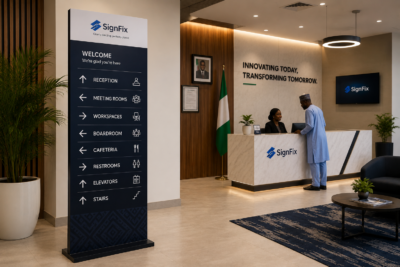
If you’re ready to enhance your signage strategy and avoid costly mistakes, our team is here to help. At Signfix Industrial Limited, we specialize in creating effective, visually appealing, and strategically placed signage that maximizes visibility and engagement for your business. Whether you need guidance on sign design, placement optimization, or brand consistency, we offer tailored solutions to meet your unique needs. Contact us today for a free consultation and discover how our expertise can elevate your brand and improve customer experience. Email us at support@signfix.ng or info@signfix.ng or Call Us +234 903 336 6660 to get started today.


In today’s fast-growing commercial and corporate environments, the ability for

The Complete Guide to Delivering Successful Signage Projects Every
Every day, millions of people move through complex environments such
Industrial environments are among the most high-risk working spaces in