Whether the aim is to create awareness or generate more sales, everyone who puts up a billboard always hopes for a return on investment. Sadly, not everyone gets it. But the big difference between those who get a return on investment and those who don’t lies in their branding and the billboard ad elements they incorporate or leave out.
This blog contains a list of checkboxes you need to check before you get started with the design of your next billboard. But before you do so, let’s get the things that don’t work out of the way first.
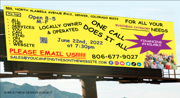
Unless your billboard is in a park or for a few special occasions, adding QR or text codes to highway billboards is not a good idea because it has the potential to distract drivers and encourage cell phone use while driving.
Avoid asking questions that have a “no” answer. If you’re going to ask a question, make it an open-ended one that will pique people’s interest!
Try not to be redundant. For example, if your URL or social media handles are the same as your company’s name, you don’t have to repeat them. The goal is to use as few words as possible during your advertisement, which reduces the number of words in your design and makes it easier for viewers to remember.
Now that we’ve eliminated what doesn’t work in billboard design, let’s examine what does!
Complex images and industry jargon may confuse your audience, especially if they are driving and only have a few seconds to look at your ad. Your billboard message will be clear and to the point if you use between seven and ten words.
When making your billboard, you need to include words that will appeal to the people you want to see it. A memorable campaign is one that is creative. But don’t be so clever that your message becomes muddled. Also, don’t be so specific that your ad becomes unmemorable.
People can easily read and understand your message if you use clear, easy-to-read fonts and colors that stand out from each other. Montserrat, Lato, Gotham, and Arial are some of the best design fonts for billboard ads.
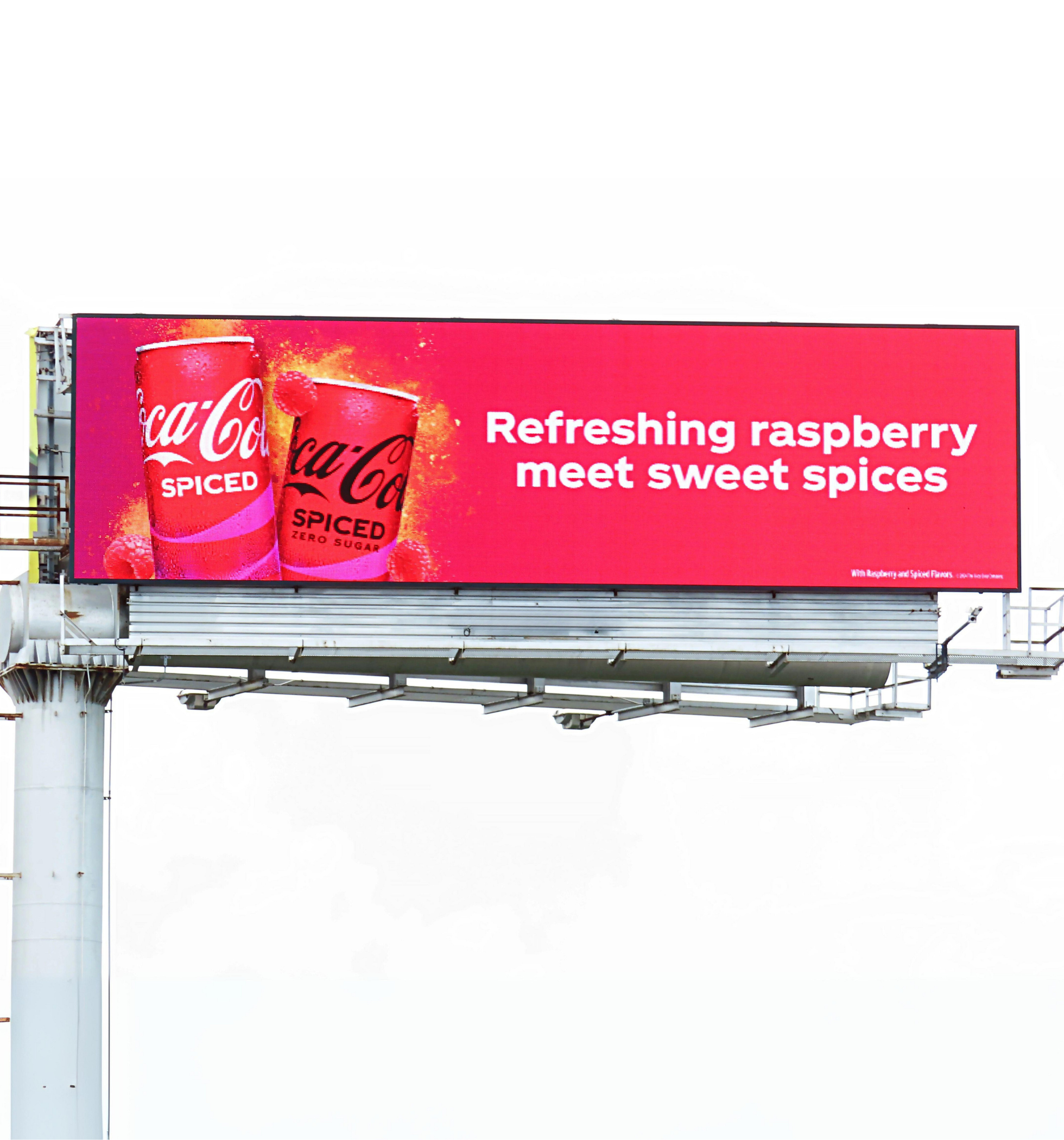
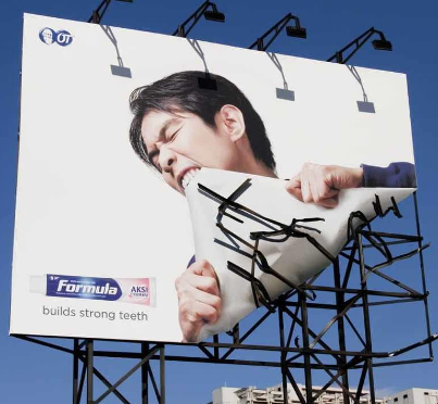
Including an image or graphic in your design is a great way to help tell a story and supplement your message. This design is a great example of how to use short text and an image together. The advertisement establishes brand recognition while attracting attention.

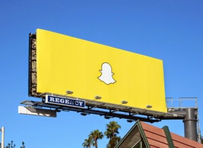
Since passersby will only have a few seconds to consume your ad, use high-contrasting colors to draw attention and make your ad clear. In this example from Chipotle, the contrasting colors emphasize the message and the brand.
As you design your billboards, remember these tips and take them into consideration. But let us know which of the tips you are already incorporating into your billboard designs.

In today’s competitive marketplace, businesses fight for attention every second.
Why Choosing the Right Signage Company Matters Your business sign
