
When you are walking into a shop, what is the first thing you see? For some people, it’s the products, but when most customers come into your store, one of the first and last things they notice is your signage. As much as it is partly true, signage here isn’t all about branding but about giving your customers direction within your shop. And if done poorly, it can cause a great deal of confusion for your customers and ultimately reduce your sales. But to do it right in a way that efficiently guides your customers and benefits your business, you must first learn the art of retail signage.
All retail signs are not created equal. Knowing the purpose of your retail signage is critical to making the right investment. It’s one of the major “whys” of the marketing industry. There are four different types of retail signage, and here is what you should know about them:
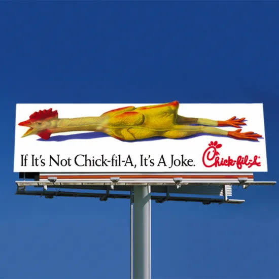
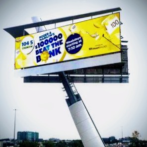
Customers’ first impression of your store is formed by your outdoor signage. As a result, it must be bright and captivating enough to grab their attention. This is often accomplished through humor, but it is also necessary to display your brand logo and, at the very least, a teaser of the type of stock you have in store.
Simply put, people must be stimulated to come into your store when they read the copy on your outdoor signage. And simply displaying a funny saying with no link to the type of stock you have will not suffice if your store is in an area where passersby are unfamiliar with your products.
This AC shop featured in this article is an excellent example of outdoor signage done right.
Directional signage is a type of sign that is designed to direct customers throughout your store. The majority of these types of signs will be hung from the ceiling and visible when customers walk through the front section. That way, time-pressed customers can quickly locate the items they are looking to purchase. However, directional signage is not limited to hanging from ceilings but can also take the form of floor decals.
You cannot afford to be too clever with your directional signage either, because it’s there to save your customers time. You should also consider providing ADA-compliant signage to help differently-abled customers navigate your store efficiently. You can make your in-store signage ADA-compliant by:
Directional signage should only be replaced when it begins to show signs of wear or when your store is remodeled.
Promotional signage employs language that will entice your target demographic(s). If you’re not sure what language to use to attract potential customers, do some research on the lingo their preferred brand uses on social media. Is their tone amusing? Rebellious? Practical? What are the words they use? Your challenge now is to apply this knowledge to your brand’s voice and inventory.
Give customers enough information about your products to make them want to buy them, but don’t use too many words when you talk about what makes your brand special.
Promotional signs should be changed often to let people know about sales and other timely offers. In some cases, huge “in your face” signs work well for some retailers, while others use a more subtle approach. But the idea is to choose what works for you.
You can use digital signage to personalize your customers’ shopping experience. The majority of retailers are already implementing digital signage, which allows them to customize their message based on the season. Rather than creating one-time signage that cannot be reused during the next sales cycle or season, digital signage can be customized and repurposed all year.
Customization, as you know, is critical to driving sales with modern customers, but there is a thin line between customization and being creepy. It is also not a smart thing to sync your customers’ browser histories to your digital signage without their express permission. In fact, a study at the Digital Signage Expo in Las Vegas found that too much personalization can turn customers off. So, if you want to create a customized ad experience with digital signage, make sure to find a good balance.
Nothing is worse than a wordy signage copy. Avoid clogging your message by using as few words as possible to convey your message. No matter what you do, mind the number of signs you display in specific areas. This is because long-winded and crowded signage is very disconcerting, especially to a customer who is browsing through your sampling or making a purchase. It will make you look unprofessional.
It is safer to use words sparingly and keep the purpose of your retail signage in mind. Do not use all caps when addressing your customers on a sign. This is perceived as yelling, and it is completely disrespectful to the customers who are spending money in your establishment.
For your retail signage to be successful, customers must be able to read it. In actuality, a recent Signs.com study discovered that smaller signs received 75% less response than their larger counterparts.
Put yourself in your customers’ shoes when deciding on font-size: Are they going to drive by your sign, walk past it, or see it on product labels? Larger fonts are also required for senior citizens and people with poor vision. Bearing this in mind will help you determine how large your font should be in order to accommodate all of your customers.
Another factor to consider when selecting fonts is the text’s clarity. Certainly, you won’t be able to reach out to potential customers with Wingdings; however, certain cursive and italic fonts are also extremely risky. This all depends on the font’s visibility from the customers’ eye level. As such, for maximum impact, use fonts that are clear and on-brand on your signage.
See this example:

When customers look at a sign, many subconscious factors are at work. To begin, employ high-contrast colors in your shop signage (black with white, dark with light, etc.); this is said to increase customer responsiveness by approximately 23%.
Color theory, or the emotions and associations we perceive when presented with a specific segment of the color wheel, is another essential aspect to consider. It’s critical to understand the conscious and unconscious associations evoked by each color so that you can ensure they’re consistent with the image you really want to convey. Some fundamentals of color theory:
In the signage industry, certain standards govern where customers will look for your signage. Customers will be able to see directional signage, for example, if it hangs from the ceiling or is higher than eye level in the aisle. whereas the promotional signage would be placed at eye level in your window display or at street level to attract flowing pedestrians.
Take into consideration that “eye level” differs for different people: children, customers in wheelchairs, and people in cars all have different sign height (and font size) requirements. And this is why you might need to experiment with signage positioning to figure out the best height for your prospective customers while also considering the intended function of each sign.
Your retail signage implementation can make or break your customers’ in-store experience. Each sign, from the chalk sign outside your store’s door to the directional signage indicating where the exit is, must be clear and precise, humorous, easy to see (for all patrons), and on-brand. Be conscious of the many applications for retail signage and implement advanced strategies such as color theory and font in your store to ensure that your retail signage doesn’t ever miss the mark. Alternatively, you can consult with experts like Signfix Advertising LLC.

Future-Proof Branding for Growing Businesses In today’s fast-paced business world,

From Concept to Installation Excellence Behind every successful signage installation

The Future Of Business Visibility The world of signage has

The Complete Guide to Long-Lasting Business Visibility Your signage is